

CEO at https://nitter.cf/t.co/YUH6P61RV3: Personalized app monetization. Show the right offer to each user, grow ARPU 30%+ 12+ years in consumer (Balance, WordPress, Grubhub)
United States
Joined October 2014
- Tweets291
- Following324
- Followers195
- Likes160




Pinned Tweet
For the last 1.5 years, we've been secretly building the tool of my dreams.
👋Introducing Botsi: AI Pricing Models for your subscription app
We built Botsi to optimize the #1 lever to grow your app: Pricing
Finally, we’re ready to share it with the world. 🌎
How does it work?
➡️ It’s pretty simple. Add a few API calls to your app.
➡️ A custom AI model gets trained.
➡️ It connects with your existing tech stack.
➡️ Botsi tells you which paywall or price to show.
➡️ Revenue goes up.
The secret is that there is no single right price for everyone.
Botsi builds and trains a custom model on your app's contextual, behavioral, and subscription conversion data.
Then, your AI model will tell you which paywall to show to which user to optimize LTV.
You can use Botsi with whatever you're using today, so it's very fast to get started.
We'll work with you to figure out the right data to send into the model and continually iterate and retrain on new data and price points.
❤️This has been a labor of love over the last year of building, testing, and improving. We appreciate everyone who has supported us so far to get here.
We're onboarding new apps as fast as we can.
Save your spot in line, and we'll reach out to schedule a call and chat!
I'm honored to be the Gem of the Week in Growth gems!! @sylvainww
We've also got some other 🔥 gems from Michael Berliner and Nick Godwin
💎 Test a “design your trial” paywall: it won in 97% of 140+ experiments, with an 11% ARR lift as a floor.
💎 Lead the paywall with only the annual plan and move monthly/weekly behind a “View all plans” link.
💎 Add a commitment pact screen to onboarding, even though it adds friction.
💎 Explain why you’re asking every onboarding question, even obvious ones like birthday or name.
and tons more!!
Get you gems here


Running a "How did you hear about us?" survey? Do this:
- Add a lie option like "TV" to catch people tapping at random
- Add "I used the app before"
- Randomize the answer order
- Use remote config so new options don't need an app update
Meet Dr. Revenue
His diagnosis: The 1st screen in your onboarding is boring and you can do better.
You can see 10-30% drop off here.
Ideas:
- Animation that starts playing
- Interactive element
- Copy hook that builds curiousity/suspense
Just stop showing the generic "Get Started" button
Everyone watches drop-off at signup, push opt-in, and the paywall.
Nobody looks at the first screen. You can lose 10-30% of new users there.
Most apps show a logo and a "Get started" button. Opal has you tap a rock until it cracks open.
Get creative, you can figure out something more engaging
Jacob R retweeted
How to create a high-converting onboarding flow:
I've got 13 principles I tried to distill down from my last 10 years in consumer apps
1. Your first screen matters and is a huge drop off point
It can lose 10 to 30 percent of new users before they tap anything. A plain welcome, get started, log in screen works for big brands; everyone else needs a hook that's interesting and easy
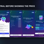
𝗠𝗮𝗸𝗲 𝘁𝗵𝗲 𝘁𝗿𝗶𝗮𝗹 𝗶𝗺𝗽𝗼𝘀𝘀𝗶𝗯𝗹𝗲 𝘁𝗼 𝗺𝗶𝘀𝘀.
People don't read paywalls.
They see a price and leave, even when the trial is visible. Trial reminders, choose-your-trial screens, and multi-page paywalls force users to notice it.

𝗢𝗻𝗯𝗼𝗮𝗿𝗱𝗶𝗻𝗴 𝗱𝗼𝗲𝘀𝗻'𝘁 𝗲𝗻𝗱 𝗮𝘁 𝘁𝗵𝗲 𝗽𝗮𝘆𝘄𝗮𝗹𝗹.
Don't drop a new subscriber onto an empty home screen. Imprint sends you straight into your first lesson; Balance auto-starts a sleep meditation for people who picked sleep.
Want more? Go listen to the latest Price Power Podcast: pricepowerpodcast.com/episod…

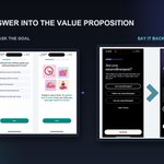
Every onboarding question drains a little energy from your user. Give something back.
Ask: "How old are you?"
Then: "We've helped 1,051,053 people your age improve their mental wellness."
Think about when you're taking vs giving back to your users to create high converting flow
Two copy swaps from Fabulous:
Don't say "subscribe." It sounds like a big commitment. They use "Get your 30-day pass" or "Get Premium."
Don't call your free plan "free." Call it "Basic."
I like free stuff. But no one wants to be basic.