

Mapping the world with Python. Buy my book here - https://nitter.cf/t.co/hAaaAxtIO9
Planet Earth
Joined January 2021
- Tweets2.3K
- Following525
- Followers77.5K
- Likes8.1K




Trying my hand at infographics. Mapping maritime choke points. Unfortunately the publicly available data used to produce this was recorded between 2015 and 2021 - Prior to the Houthis actions in the Red Sea and the war in Iran, which no doubt change this picture.

I am excited to be representing @SynMaxInt at the #EsriUC2026. If anyone is attending and wants to discuss maps or ships, please get in touch,
Forest Loss. This map shows forest loss since 2000 in Africa. Defined as a stand-replacement disturbance, or a change from a forest to non-forest state.

Forest Loss. This map shows forest loss since 2000 in South America. Defined as a stand-replacement disturbance, or a change from a forest to non-forest state.

Forest Loss. This map shows forest loss since 2000 in Asia. Defined as a stand-replacement disturbance, or a change from a forest to non-forest state.
For those who care - projection is EPSG:27703 is WGS 84 / Equi7 Asia

Forest Loss. This map shows forest loss since 2000 in Oceania. Defined as a stand-replacement disturbance, or a change from a forest to non-forest state.

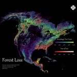
Forest Loss. This map shows forest loss since 2000 in North America. Defined as a stand-replacement disturbance, or a change from a forest to non-forest state.

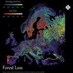
Forest Loss. This map shows forest loss since 2000 in Europe. Defined as a stand-replacement disturbance, or a change from a forest to non-forest state.

This bivariate map uses WRI's Aqueduct 4.0 data to show projected gross water demand (white→orange) vs. blue water availability (blue→purple) under a business-as-usual scenario by 2065–2095.

This bivariate map uses WRI's Aqueduct 4.0 data to show projected gross water demand (white→orange) vs. blue water availability (blue→purple) under a business-as-usual scenario by 2065–2095.

This bivariate map uses WRI's Aqueduct 4.0 data to show projected gross water demand (white→orange) vs. blue water availability (blue→purple) under a business-as-usual scenario by 2065–2095.

This bivariate map uses WRI's Aqueduct 4.0 data to show projected gross water demand (white→orange) vs. blue water availability (blue→purple) under a business-as-usual scenario by 2065–2095.

This bivariate map uses WRI's Aqueduct 4.0 data to show projected gross water demand (white→orange) vs. blue water availability (blue→purple) under a business-as-usual scenario by 2065–2095.
For those who care - projection is EPSG:27703 is WGS 84 / Equi7 Asia

This bivariate map uses WRI's Aqueduct 4.0 data to show projected gross water demand (white→orange) vs. blue water availability (blue→purple) under a business-as-usual scenario by 2065–2095.
Inspiration came from this post from @Esri - esri.com/arcgis-blog/product…


Mercury! We may as well continue the series and explore the rest of the rocky worlds in the Solar System.


I made this map for Earth last week and you seemed to like it so here is it for Mars, the distribution of elevation levels on the earths surface. I have used a blue-red colourmap to give it the illusion of oceans. Negative values indicate terrain below the Mars areoid — a gravitational reference surface defined where atmospheric pressure equals 610.5 Pa (the triple point of water) — which serves as the zero-elevation datum in place of a sea level.
