

Brand + web for B2B software & AI founders. 100+ clients. $1M+ on Contra. Founded by @danielgbright Clients: Bolt, Lovable, Contra & Magic Path.
Available for work
Joined December 2024
- Tweets536
- Following82
- Followers229
- Likes543





BrightStudios® retweeted

Two review rounds. Signed off seven days after their copy arrived.
That's what a four-page site for an AI agent governance company took. One round for wireframes, one for visuals. If you're a founder about to review a site design, you know the other version. Every new file makes you hunt for what changed, the rounds pile up and the launch slips.
One habit kept it to two. Every version I sent had a short note beside each section that changed, so their team went straight to the edits. The second wireframe version had a redrawn main diagram, flagged with a note, so they could judge that one change on its own.
Skip the notes and feedback lands on sections nobody touched. An approved headline gets reopened, and every extra round costs you days.
After 100+ career clients across brand and web, my ask to any studio: mark every change, right beside the change.
You can only approve what you can see.

Founders: if your site explains an older version of your product, people book a demo just to ask what it does.
100+ career clients, 5.0 on Clutch, 115 Contra reviews (2 Oct 2026). Your site should explain the product you have today.
Case studies: brightstudios.com/work


20
A luxury rental community's property team wanted a site they could update themselves. We designed and built it. The property management company wrote on Contra:
“It was a great experience working with Daniel and we would highly recommend his services!”

30
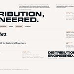
An early-stage distribution studio's identity has a broad palette and loud graphics. So the type had to calm things down. Big extended headlines hold their own against the artwork. Small monospaced details add a technical feel.

23
BrightStudios® retweeted

Last week we brought together studio founders, designers, and independents at the Contra office to talk about the future of creative studios.
Huge thank you to our panelists @Danielgbright, @theShaneLevine, @jameygannon, and @thenickpattison, and our moderator @RonGoldin for sharing their insights.
And to everyone who joined us, thanks for making it such a great night! More to come 🚀
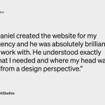
A creative agency needed a site for the owner's own copy and campaign films. One they could update without a designer. The owner, after we built it:
“He understood exactly what I needed and where my head was at from a design perspective. His work is top level.”

41
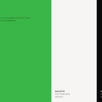
A UK farming network's colors show up in its own channels and in farmers' posts. So every color needed a job. In the identity we designed, kelly green leads. Neutrals handle text, surfaces and lines.

27
A big luxury rental community was stuck with a WordPress template. It didn't leave much room to show the homes, amenities or neighborhood. So the site we designed and built runs on one structure. Details, FAQs and metadata follow the same pattern everywhere.

35
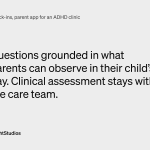
An ADHD clinic's parent app asks families about their child's day. But clinical assessment is the care team's job. So we rewrote the foundation screens around what parents can actually see, and kept the check-in questions there.

33
A car rental platform in Greece needed messaging that could earn mainstream trust. Its reviews already had the answer. People described the service by what it took away, from deposits to bureaucracy. In Greek that's «χωρίς»: “without.”

2
79
A studio that helps AI companies get one product story out already had its positioning. It needed an identity to match. Before handoff we tested it on real pieces: posters, social layouts at small sizes, and a website hero.

2
39
A UK farming network's brand audit found inconsistent type and assets. And the guidelines had to work with no designer around. So the icons come with a construction grid. Every new icon starts from it, and the set stays consistent.

1
3
72
A focus app's identity had to hold up on a screen the platform mostly controls. It's the shield you see when you open a blocked app. There's room for an icon, a short line and two buttons. We kept that line the same for the whole session.

1
51
An AI talent platform was moving past traditional staffing. Its brand had to explain the AI part and still keep people at the center. So we did the strategy and the identity together, from positioning to the wordmark.

46
A warehouse robotics company was growing from one product into a bigger portfolio. Buyers needed to see where each one fits. So on the site we designed, every product starts with the warehouse problem it's for. Case studies sit right next to it.

47
The landing page for an online MBA alternative had twelve sections, all about the same weight. We cut it to ten and simplified the type. Now it reads in the order a buyer actually decides.

3
81
An AI marketing platform covers everything from content strategy to analytics. That's hard to explain in one view. So on the site we designed and built, the homepage just introduces the workflow. The product pages carry the detail.

42
An enterprise maritime tech company had announced its rebrand launch. The website we designed had to be ready for it. It also had to fit six product brands and an acquired company into one structure.

1
46
A focus app that moves real money had to show people where that money goes. Sometimes a donation is logged but hasn't reached the charity yet. So in the app we designed, that moment gets its own screen: “Still owed.”

38
