

@cfnapa
Account based inUnited States
About this account
- Account based in
- United States
- Connected via
- Web
Account-level information from X, not a live location or the device used for a specific post.
Celebrating 50 years of developing and transforming alcohol & NA beverage brands through strategic design & marketing. Est. 1976 Drink Wi Drink With Your Eyes®
Napa, CA
Joined June 2010
- Tweets3.8K
- Following2.4K
- Followers2.4K
- Likes259




Our design for @CliffLedeWine's Radio Edit features a rock-worthy interpretation of the Cliff Lede logo with the legal information hidden in plain sight, arranged to resemble the song list and credits on an album, and an emboss and die cut in the center of the label.


Music is an ever-present influence at @CliffLedeWine. The Backstage Tasting Lounge features art by rockstars & the vineyard “rock blocks” are named after the winery owner’s favorite songs & albums. For Radio Edit, we created a design inspired by the look of vinyl record labels.

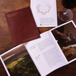
The @StagsLeapAVA is dedicated to elevating the famed appellation while fostering collaboration between the network of neighboring wineries & grape growers. We reimagined their visitor's guide to match the quality of Stags Leap AVA wines while serving as a reference for tasters.


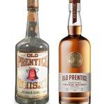
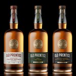
Old Prentice Whiskey is one of the oldest Whiskey brands in the United States. To honor the brand's roots and pedigree, we re-illustrated the iconic bell logo and locked it with the wordmark to create a versatile emblem.

Born in Anderson County, Kentucky in 1855, Old Prentice Whiskey is one of the oldest Whiskey brands in the United States.
Inspired by the historic typography, we refined the wordmark with more modern letterforms while keeping some of the quirkiness of the original shapes.


COUP CLASH is flipping the non-alcohol market on its head. Made for the non-conformers - Drink what you want, when you want, unapologetically. @COUPChampagne
We redesigned the Bear Moon labels utilizing rich colors and a horizon line of silhouetted trees, inferring a night scene that gives the brand a sense of place and embraces the brand’s Northern California roots. Color and large type for each spirit name provided a clear system
Bear Moon Spirit is a California-based brand that celebrates reflection & rebirth. The name is based on the full moon in January, dubbed the bear moon by Native Americans for its alignment with the birth of black bear cubs.


The can format of Señor Sangria Spritz provided a 360-degree branding opportunity and allowed for a detailed list of the product promises, reinforcing the brand’s usage of quality ingredients.


For the new Señor Sangria Spritz, we illustrated collages of colorful fruit that capture the fun, lighthearted personality of the brand and to clearly communicate the fresh flavors and juices utilized in the Red and White Sangria Spritz.


Señor Sangria is a family-owned brand that crafts homemade-quality sangria with real fruit juices. To serve the expanding RTD market, we partnered with them to create the fresh packaging design for a new canned offering - Sangria Spritz.


For Ðồi Ðá's Yountville Cabernet Sauvignon, we developed a graphic inspired by shapes and patterns found in Vietnamese décor. The rich red hues of the label give the wine a striking look and are representative of good luck in Vietnamese and other Asian cultures.


The brand name, Ðồi Ðá, is Vietnamese for “Rocky Hill” and is inspired by the landscape of the previously undeveloped site. For their Yountville Cabernet Sauvignon, the design needed to be bold while paying homage to the brand owner’s Vietnamese heritage.

We are very excited to announce that our design for Yellowstone Cocktails is on the Shortlist for the @PENTAWARDS 2026!
The refreshed portfolio for St. Augustine Distillery refocuses away from the agricultural motifs of their previous packaging and back on the distillery. The redrawn distillery icon with a backdrop of rays of Florida sunshine became the foundation of the new brand look.


We reimagined the illustration of @StAugDistillery's historic building into a modern icon for the brand. The label diecut and frame detail echo the faceted shoulder of their custom bottle and the architectural details found on the distillery building.


St. Augustine, Florida has a storied history as the first Spanish settlement. @StAugDistillery is one of the first distilleries in the state.
We developed an iconic label design that drew inspiration from their custom bottle and historic distillery building.

The new packaging design for @_spiritworks reflects the brand's renewed focus on Sloe berry-based spirits and the mysticism that surrounds the berries.
The new wordmark for @_spiritworks combines whimsical letterforms and the brand’s existing gear icon. The updated mark connects the previous, industrial look of the packaging with the new, mystical design, inspired by the rich folklore of the Sloe berry.
