

Engineering Lead | Systems & Platform Architecture | Speaker
- Tweets9
- Following19
- Followers13
- Likes30




ALT Kaleb Garner speaking at Commit your Code

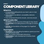
ALT Element 1, Component Library What It Is: Composable building blocks your team uses to meet business needs Value baked in by default... accessibility, behavior, interaction One component should do one job... and only one job What It Looks Like: Primitives: the raw structure of the app (i.e. Box, Stack) Components: the building blocks of the app (i.e. Button, Field) Layouts: the foundation of the pages (i.e. PageShell, layout.tsx) True Impact: Developers: Stop rebuilding foundations, spend your time solving business needs Users: Consistent, predictable interactions Stakeholders: Faster development timelines, fewer regressions

ALT Element 2, Design Tokens What It Is: Single source of truth for shared visual values Color, spacing, typography, motion... singular source of truth Not a style guide... the true values that are consumed by the application What It Looks Like: Global tokens: the raw value (i.e. #4f46e5) Semantic tokens: the alias layer (i.e. brand.primary) Output: CSS properties that are consumed by the components True Impact: Developers: No more “which color is our brand color?”, singular source of truth Users: A product that looks intentional, not thrown together Stakeholders: Rebrand or variants can be rolled out without massive refactors

ALT Element 3, Shared Patterns What It Is: Proven solution to recurring UX problems in an application Decided once at a systematic level, not at a feature level The source of truth to the application’s behavior What It Looks Like: Component Patterns: The consistent functionality baked into components (i.e., table filtering / sorting) System Patterns: The consistent functionality of the application (i.e. drawer vs. modal) Negative Patterns: Empty states, loading states, error handling, intential decisions True Impact: Developers: Limits decisions needed on a feature-to-feature basis Users: Builds confidence in how the system is going to respond across multiple surfaces Stakeholders: Consistent experience without auditing every team’s individual choices