

Typographer, information designer, academic. Vice Principal, Hong Kong Design Institute.
Hong Kong
Joined January 2009
- Tweets948
- Following524
- Followers895
- Likes349






Keith Tam retweeted

Some people say you shouldn’t write in books, but I would tend to disagree. I think the doodles really bring a book to life! (The burning house is a personal favourite) [RESERVE—881.08-ANT]


Keith Tam retweeted

What's your favorite thing about paper books? 📚 t.ted.com/Al7Xw8X

Keith Tam retweeted

Adrian Shaughnessy on Ken Garland, a “disruptive and questioning spirit” > bit.ly/2Tgv5Vy

Keith Tam retweeted

Hans Schmoller's work and notes on The Complete Pelican #Shakespeare. From @UniRdgTypoColls for #ShakespearesBirthday and #WorldBookDay #ShareYourShakespeare #ShakespeareDay


Keith Tam retweeted

Last but not least, here's the link! myfonts.com/fonts/tabular-ty…
Keith Tam retweeted
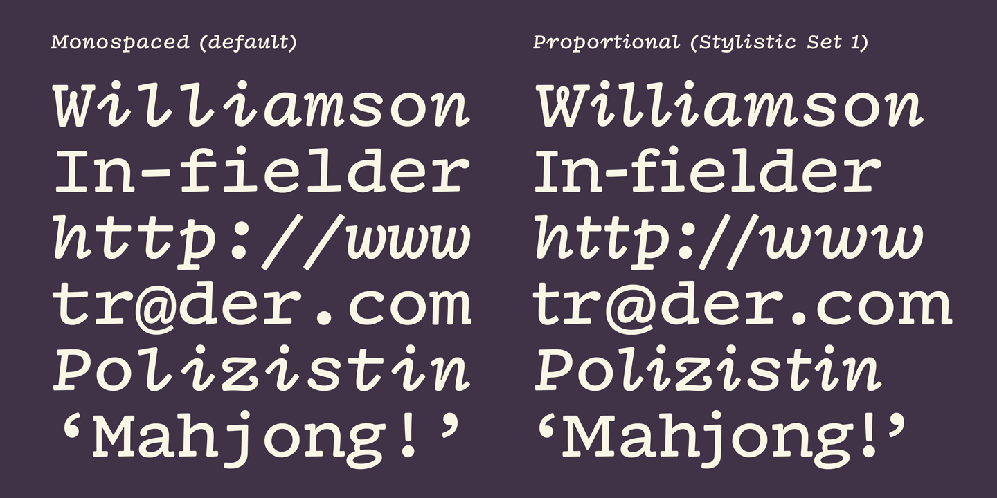
IBM’s intention was to make a proportional face by narrowing and widening some characters, which are available in Dossier as a stylistic set 1 (ss01), stylistic alternate (salt), and proportional numerals (plum).


Keith Tam retweeted
Dwiggins was approached on multiple occasions by typewriter companies, most notably Underwood and IBM. I used the sketches and trials from these projects to make one family. (Dwiggins Collection at Boston Public Library, photos courtesy of @WADwiggins)


Keith Tam retweeted
I’m thrilled to announce a new monospaced typeface called Dossier! It’s a revival of William Addison Dwiggins’s unfinished typewriter faces.


Keith Tam retweeted

How did I not mention I used Bungee by @djrrb for the FontGoggles icon? The alternates for vertical layout, arranged diagonally. Such a good font!


I made something. It sounds boring: it's an application to look at fonts. But it can do a lot! Most of which I described on a little web page, where you'll also find a download link: fontgoggles.org
Keith Tam retweeted

the simpleton: Dodgy chart hits the front page qwertyrob.blogspot.com/2020/… (Simpleton blog is back...)
Keith Tam retweeted

Red meat is about 35 times as damaging to the environment as a bowl of greens, a new study says econ.st/2XYEoI9
Keith Tam retweeted

New Release: Blanchard. A small, but perfectly formed family of a elegant thin slab serif, made for text and headlines. Originally cut by Blake & Stephenson in Sheffield, with a newly created italic, a face of real character, with many serifs joining. commercialclassics.com/catal…


Keith Tam retweeted

On the anniversary of Gerard Unger’s death, I still think it is early for a proper reflection on his work. Until that time, my words about him on behalf of @ATypI : medium.com/atypi-notes/the-l…

Keith Tam retweeted

Just some of the dos and don'ts of designing pedestrian maps and plans buff.ly/2UBDFKj
#wayfinding #map design

Keith Tam retweeted

All type nomenclature is provisional and contingent on technology, but here's my tuppenceworth (from tinyurl.com/typo-vsi)

Keith Tam retweeted

Excited to announce our upcoming exhibition The Wolpe Exhibition @TypeArchive. Join us Sept 29 - Oct 30 bit.ly/2fkVquT #MeetWolpe

Keith Tam retweeted

New typefaces from the 2017 MATD @typefacedesign.
This is just getting better and better. Congrats to you all!
typefacedesign.net/
Keith Tam retweeted

My thoughts on graphic design research in The Design Journal (thanks for the invitation)
tandfonline.com/eprint/qItXp…
Keith Tam retweeted

Less than a week till our June #SDStalks w/ @atkinsglobal’s @FranceAngelelli – have you booked? bit.ly/SDS_Jun17 #pedestrianModelling

Keith Tam retweeted

MA Information Design, Creative Enterprise, Book Design degree show at Reading 12–17 June, private view 8 June 5pm infobookdesign.co.uk

