

Running https://nitter.cf/t.co/k1b7LOeliO / Helping AI & tech founders make their products easier to understand, trust and buy through brand & web design. Clients raised $15M+.
DM or visit the website →
Joined October 2024
- Tweets7.8K
- Following472
- Followers2.3K
- Likes9.4K




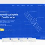


If you're a tech founder spending $20K on a rebrand, asking your designer to make you look like your competitors is one of the easiest ways to waste that money.
Over the last 2 years, I've worked with 10+ tech teams that raised $15M+ in funding. And one thing I always do before designing is study what everyone else in the industry looks like.
Not to copy them. To understand what we should avoid.
For this aerospace project, that meant moving away from the usual dark backgrounds, glowing rockets and futuristic 3D renders.
Instead, I built the art direction around the engineering process itself. Blueprints, technical drawings, handwritten annotations and paper details that became part of the entire website, not just the hero.
The result is a visual language that still feels relevant to aerospace without looking like every other company in the industry.
That's what I want good art direction to achieve. A brand that people recognize, remember and associate with one company.
Your competitors are research. They shouldn't be your creative brief.

If you're a tech founder spending $20K on a new website, but your marketing team still needs a developer to launch a landing page, you're paying for the same website twice.
Once to build it. And again every time you want to change something.
Over the last 2 years, I've worked with 10+ tech teams that raised $15M+ in funding. And one thing I've learned is that a website's value depends just as much on what happens after launch.
Imagine your startup releases a new feature and marketing wants to test two different landing pages.
Instead of launching them, someone opens a development ticket. Engineering is busy working on the product, so the campaign gets delayed. Or worse, you start sending paid traffic to a page that doesn't reflect what you're actually selling.
That's why I think about content management before designing a single section.
When building websites for tech startups, I want marketing teams to be able to update messaging, rearrange approved components, publish case studies, and create campaign pages without touching the code.
The important part is building that flexibility into the design system without giving up consistency or quality.
Developers should be spending their time building the product, not changing headlines and rearranging cards every week.
A startup website shouldn't just be designed for launch day.
It should be designed for the next 100 changes.
6
5
155
Marto retweeted
If you're a tech founder spending $20K on a rebrand, asking your designer to make you look like your competitors is one of the easiest ways to waste that money.
Over the last 2 years, I've worked with 10+ tech teams that raised $15M+ in funding. And one thing I always do before designing is study what everyone else in the industry looks like.
Not to copy them. To understand what we should avoid.
For this aerospace project, that meant moving away from the usual dark backgrounds, glowing rockets and futuristic 3D renders.
Instead, I built the art direction around the engineering process itself. Blueprints, technical drawings, handwritten annotations and paper details that became part of the entire website, not just the hero.
The result is a visual language that still feels relevant to aerospace without looking like every other company in the industry.
That's what I want good art direction to achieve. A brand that people recognize, remember and associate with one company.
Your competitors are research. They shouldn't be your creative brief.
If you're building an AI startup with four different agents, the last thing you want is for your product to feel like four more tools people have to learn.
That's exactly what I wanted to avoid when designing Modo.
Over the last 2 years, I've worked with 10+ tech teams whose companies raised $15M+ in funding. And one thing I've learned is that explaining what technology can do isn't enough. People need to understand what they can actually accomplish with it.
Modo has four agents: Research, Analyze, Create and Automate.
The easy approach would've been to give each agent its own beautiful section, explain its features, and move on.
But that would leave potential customers figuring out how everything works together. And if they can't picture themselves using the product, you've made their decision to buy much harder.
So I designed the entire experience around one project brief.
Research gathers information, Analyze turns it into findings, Create produces the work, and Automate handles what comes next. All four share the same context, with human approval before important actions.
We then built a visual system around that experience. One geometric shape becomes four different agent symbols, with consistent colours carried across the brand, marketing website and product interface.
Instead of making visitors read through four disconnected feature lists, we're showing them how an entire workflow gets completed.
That's the part I think a lot of AI founders underestimate.
Your customers shouldn't have to figure out how your technology creates value.
Your design should make that obvious.
Full case study: atreo.studio/case-studies/mo…

3
4
174
If you're a tech founder spending $10K/month on ads, the last thing you need is a homepage with 15 sections that still leaves people wondering why they should buy.
That's $120K a year bringing potential customers to a website that isn't making their decision any easier.
Over the last 2 years, I've worked with 10+ tech teams that raised $15M+ in funding, including a cybersecurity company backed by $5M.
And something I've learned from designing for these companies is that founders often want to explain the parts of their product they're most proud of, rather than the parts customers actually care about.
Take cybersecurity. You can spend half your homepage explaining detection models, infrastructure and technical capabilities.
But I'd rather show someone a real example of a threat being detected, what could've happened without the product, and how the software helps resolve it.
In one section, you've explained the problem, demonstrated the product and given someone a reason to consider buying it.
That's the kind of thinking I bring to website redesigns.
I look at why customers buy, what makes them hesitate and which parts of the product actually influence their decision. Then I use that to decide what goes in the hero, what needs a demonstration and what can move to a deeper page.
Because the problem usually isn't that your technology is too complicated.
It's that you're expecting potential customers to figure out its value on their own.
3
161
I'm about to start working with a tech startup that's raised $5M, has 20+ employees, and makes over $50K a month.
But their website still looks like they haven't landed their first customer.
They've spent years building their product, growing their team, and getting customers. Yet their website barely shows any of that.
And that's a problem when you're trying to grow.
People visiting for the first time don't know how good your product is or how much your company has achieved. If your website looks outdated, you're giving them a reason to question whether they can trust you.
That's why I always start by understanding who the company sells to, why customers choose them, and what makes their product worth paying for.
Then I focus on making those things obvious through better messaging, clearer product visuals, and real proof that the company delivers what it promises.
Because the goal isn't to make a startup look bigger than it is. It's to make sure its website reflects the business it has already built.
You've worked hard to grow your company. Your website shouldn't make you look like you're still starting out.
6
4
285
Over the last 2 years, I’ve worked with AI companies valued at $500M+ and backed by $15M+ in funding. And one of the biggest problems I’ve seen has nothing to do with their technology.
It’s how they communicate it.
Founders and engineers love talking about their models, infrastructure, latency and everything they’ve spent years building. But most people visiting their website are trying to answer much simpler questions.
What does this product do? Is it for me? How is it going to make my life easier?
When I’m designing websites for these companies, my first priority is making those answers immediately obvious.
That starts with understanding who the product is for, what problems it solves and why someone would choose it. Then translating that into clear messaging, a logical page structure and product visuals that actually demonstrate its value.
I want someone who’s never heard of the company to understand what the product does and why it matters within a couple of minutes.
Because when a website makes people work to understand the product, it creates real business problems. Potential customers leave without understanding the value, sales teams spend more time explaining the basics, and money spent attracting visitors produces fewer opportunities.
You can build the most sophisticated technology in the world, but if people can’t understand why they need it, that sophistication won’t help you sell it.
The technology can be complex. The experience of understanding it shouldn’t be.
1
2
251


Projects section for an aerospace comapny website 📌
The white page folds like a tri-fold and the cork board shows up behind it. Every project is pinned on a different paper: graph, blueprint, legal pad….

9
389
A lot of founders come into a branding project with references already in mind.
Brands they love, identities they admire, things they’ve seen that they’d like to bring into their own company.
And I completely get it. When you see something beautifully designed that communicates exactly what you think a brand should, it’s natural to want something similar.
But I think that’s where things can get tricky.
What works for one brand might have very little to do with another. Different product, different audience, different personality, different reasons for existing.
And if you start building around those references too early, they can end up shaping the identity before you’ve really understood the company behind it.
I think references are great for exploring how to express an idea. Just not for deciding what that idea should be in the first place.
3
2
311
Most projects at Atreo start with a lot of questions, rough ideas and messy notes.
Before touching the design, we try to understand the product, who it's built for, what makes it different and why someone should care about it.
Once we have that figured out, we work on the messaging and information structure. What should visitors understand first? What needs more explanation? What can we remove? We want every section to have a clear purpose before we start thinking about how it should look.
Then comes the visual direction. Typography, layouts, interactions, illustrations and all the details that bring the experience together. That's where we explore different approaches, test ideas and refine until the design communicates what we want it to.


7
591
New WIP for an aerospace project 🛰️
We went with blueprints, sketches and handwritten details instead of the usual futuristic visuals and 3D renders.
I’ve always believed good design comes from understanding an industry, not blindly following its visual conventions.

2
24
629
I genuinely think we're reaching a point where the biggest limitation in web design isn't what you can build anymore. It's what you're capable of imagining.
A couple of years ago, I'd come up with an idea and immediately start thinking about how difficult it would be to execute. Now I can spend much more time exploring how far I can actually take it.
The tools we have today make experimenting with ambitious ideas so much more accessible. But they don't give you the ideas, the taste to make the right decisions, or the judgment to know when something actually works.
And I think that's what makes this such an exciting time to be a designer.
Because when building something becomes easier, what really sets your work apart is what you choose to create in the first place.


4
18
458
A closer look at this one, an agritech website I'm working on at Atreo. I like how the product data sits directly over the fields here, giving each number a place and a bit more context.

2
8
370