

Creative ideas. Made real. Design • Websites • Automation • UGC Ads • Video I help brands stand out & grow without technical headaches.
United Kingdom
Joined August 2024
- Tweets8.7K
- Following3.9K
- Followers3.3K
- Likes16.7K








Pinned Tweet
The best souvenir can be the ordinary thing that accidentally travelled through the whole story.
A bakery wrapper, a train ticket or a small notebook can hold the memory more clearly than something with the city name printed across it. The connection comes from what happened around the object. It is a useful reminder that meaning often arrives through use, rather than being fully installed by the packaging.
Surprise belongs in the story; the practical conditions deserve plain language.
A gift can keep its contents hidden because the mystery is part of the pleasure. A delivery charge or missing component has a different effect. Creative presentation can be playful while the practical information stays plain. The audience should be curious about the story, without having to investigate the basic conditions of what they are considering.
The household weather expert is usually the person who went to the door.
They return with three confident sentences after every app offered a different opinion. Who provides the unofficial forecast in your house?
Recipe preparation time seems to imagine a very efficient version of the kitchen. The ingredients are waiting politely, the knife knows what to do and nobody has to find the right bowl. Real cooking includes a few more small introductions before anything is ready to enter the pan.
The timer appears to assume somebody has already peeled, washed and located everything. Meanwhile, you are reading the next instruction and discovering that finely chopped is doing considerable work inside a very small phrase. Dinner will still happen. The advertised preparation time may simply be operating in a kitchen with a slightly different relationship to reality.
Explore my creative services: mrcreatech.site

An old family photograph can contain a whole exhibition of ordinary design.
The packaging on the table, the pattern of a curtain and the lettering on a shopfront explain the time almost as clearly as the people do. Those background details were not chosen for history. They were simply the everyday world. Looking closely at them can make the present feel more interesting too.
What background detail do you look for in old family photos?
Less in the pocket.
A speculative concept campaign for a card wallet, built around a familiar object with a distinct visual personality. The visual story moves between a recognisable shape and a quiet construction detail. It expresses a restrained everyday aesthetic without inventing material certification or durability results.
The composition gives the product the leading role. Scale, lighting and a controlled colour palette carry the story, while supporting props establish an everyday context. The intention is to make the scene worth looking at and the object easy to understand.
This is independent concept artwork for a fictional unbranded product, rather than a commissioned advertisement.
Explore my services: mrcreatech.site

Let the corner grow.
A speculative concept campaign for a plant pot, built around a familiar object with a distinct visual personality. The concept begins with a neglected corner and a small object that changes its character. The plant and wall provide context while the planter remains the unmistakable focal point.
The composition gives the product the leading role. Scale, lighting and a controlled colour palette carry the story, while supporting props establish an everyday context. The intention is to make the scene worth looking at and the object easy to understand.
This is independent concept artwork for a fictional unbranded product, rather than a commissioned advertisement.
Need a product campaign? DM @mrcreatech.


Regular customers know the local workarounds. New visitors don't.
You bring the right change, choose the easier entrance or avoid the chair near the awkward draft. Experience turns those details into an automatic adjustment. It is worth remembering that a newcomer has not yet learned the local workaround. What feels effortless to a regular may still contain several unanswered questions for somebody arriving today.
What local workaround do regulars know that newcomers always miss?
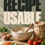
Make the recipe usable.
A recipe is easier to follow when you know where it is going. Read the method before starting and arrange what you need in a practical sequence. This is about a calmer cooking experience, not turning dinner into another performance to measure.
The sequence starts with a familiar situation, makes the missing context visible and offers one manageable change. It is deliberately practical: something a person can understand and try without learning a new system or buying another tool.
The middle of cooking is a poor time to discover the missing step. A useful piece of communication should make the next encounter easier for the person who will actually use it. That includes ordinary moments at home, in a shop and on a phone.
Need clear visual communication? DM @mrcreatech.


Show the real shadow.
Lighting products are experienced through what they illuminate as much as through their shape. A scene that shows the light falling on a surface explains the mood more clearly.
The environment can demonstrate the concept without inventing a technical performance claim.
The illustration makes the comparison concrete so the idea can be understood without specialist vocabulary. Look at the object in the setting where someone encounters it, then decide which piece of information they need at that moment. That small shift in perspective gives the design a useful job.
Have a project in mind? DM @mrcreatech.

Consistent photography should preserve the differences people need to compare.
The lighting is identical, the crop is neat and the camera has moved to make every item fill the frame. A shared scale or a familiar reference can restore the information the styling removed. Consistency should help comparison rather than flatten the differences a buyer needs to understand before choosing between the options.
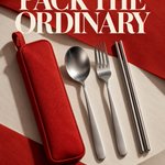
Pack the ordinary.
A speculative concept campaign for a stainless cutlery set, built around a familiar object with a distinct visual personality. The campaign makes an everyday set feel considered through a simple arrangement. Steel catches the light while the red sleeve gives the composition a recognisable anchor.
The composition gives the product the leading role. Scale, lighting and a controlled colour palette carry the story, while supporting props establish an everyday context. The intention is to make the scene worth looking at and the object easy to understand.
This is independent concept artwork for a fictional unbranded product, rather than a commissioned advertisement.
Explore my services: mrcreatech.site

Certain foods carry the occasion along with the flavour.
The thing eaten on a long journey, the snack after an exam or the dish that appears when relatives visit can carry a whole occasion inside it. Taste is only one layer. The timing and company become part of what the food means, which is why recreating the recipe does not always reproduce the exact feeling people remember around it.
Which food comes attached to a particular kind of day?
An ordinary plant becomes part of the household the moment someone gives it a name. Now moving it is a conversation, a new leaf is an event and the corner of the room has a resident. Small objects have a way of becoming much more personal through repeated attention.
The next leaf receives an announcement. Moving the pot becomes a discussion about whether the resident will like the new corner. Somebody asks how the plant is doing before asking about the rest of the room. Giving a name to an ordinary thing can be the first step in accidentally creating another household personality.
Have a relatable campaign idea? DM @mrcreatech.

Regular customers navigate partly by knowing which information they can ignore.
You recognise the sections, the usual position of things and the signs that matter to your visit. A newcomer cannot make those choices as quickly. Good public information supports both experiences: enough structure for the person arriving for the first time, without forcing regular visitors to read the whole place again.
Everybody finding the meeting point on the first attempt deserves a quiet celebration.
The directions worked, the landmark existed and nobody accidentally chose the other branch of the same café. The plan has survived contact with real streets and individual interpretations. Good coordination often feels uneventful when it succeeds, which is why the person who supplied the useful details may never hear how much uncertainty they quietly removed.
What's your group's most frequently misunderstood meeting point?
Make replacements easy.
People often need an accessory or replacement long after the original packaging is gone. Keep the identifier accessible on the item or in the purchase record.
A small naming decision can determine whether an otherwise useful object is easy to keep using.
The illustration makes the comparison concrete so the idea can be understood without specialist vocabulary. Look at the object in the setting where someone encounters it, then decide which piece of information they need at that moment. That small shift in perspective gives the design a useful job.
Explore my services: mrcreatech.site

Showing the difference can be clearer than describing it with increasingly confident adjectives.
The maker holds two materials beside each other or opens the item to show the construction. You can see the distinction instead of translating adjectives into a guess. That directness is useful online too. When the difference can be demonstrated clearly, the content becomes more informative without needing to sound more authoritative.
The helpful detail is often something the expert no longer notices doing. Remembering to describe it can turn a confident performance into an explanation that another person can genuinely use without the expert standing nearby.
A stained recipe page usually has a better story than a pristine one.
A folded corner, a small note and a stain can show which pages entered ordinary life. The object is no longer only a collection of possibilities. It contains evidence of attempts, preferences and meals that actually happened. Some kinds of use make a book feel richer rather than simply less new, even if the cover would prefer a cleaner story.
Which page in your recipe book has clearly lived the most?
An old favourite object may be keeping a promise that the newer version overlooked.
It might be a handle that fits their hand, a pocket in the right place or a lid that opens easily. A newer version may have more features and still miss that relationship. Listening to the reason behind the preference is more useful than assuming attachment to an old object is simply resistance to change.
Same item. two settings..
A product can belong to more than one part of a person's day. Show realistic settings that reveal different uses while keeping the object recognisable.
Variety is useful when it expands understanding rather than merely changing the background colour.
The illustration makes the comparison concrete so the idea can be understood without specialist vocabulary. Look at the object in the setting where someone encounters it, then decide which piece of information they need at that moment. That small shift in perspective gives the design a useful job.
Have a project in mind? DM @mrcreatech.
