

full stack designer & developer
Joined January 2022
- Tweets499
- Following1K
- Followers263
- Likes4.8K




Tyler retweeted
Asset Gen MCP: tools.blueprintstudio.ai/mcp…
Site: conch.blueprintstudio.ai

Asset Gen MCP: tools.blueprintstudio.ai/mcp…
Site: conch.blueprintstudio.ai
Tyler retweeted

The best thing new grad designers can do when starting a job is try to forget most of what they just learnt in school.
Check out the live page, super detailed isometric scroll animation with interactive hover callouts
Thank you for the creative freedom and trust @proofofmud
One of the better pages we’ve made so far at @bpstu

Buzzwords. Technical jargon. Tough concepts.
Understanding how Bitcoin infrastructure actually works shouldn't be this hard.
So we built a site that makes it simple.
See for yourself: arch.network/chain
Storyboards for Logical's YC launch video.
We collaborate on narrative and visual direction before production begins. For Logical, we mixed live action with product captures to show the product in real-world context.


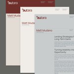
Brand identity for Autara.
Deep burgundy, ethereal star-esque brandmark, serif headlines, stationery that feels like a private wealth firm.
When the product is liquidity without selling, the brand should feel like patience rewarded.


Mobile UI for LivingIP.
Not the desktop squeezed into a phone. Three-column layout becomes single-column, leaderboard gets its own screen, voting sits at thumb height.
Whitespace isn't empty space. It's what makes a complex product feel simple at a smaller scale.
Wireframe to final for LivingIP.
Three columns from day one.
Structure was right on the first pass.
The visual layer is what made people want to stay.
Gradient avatars, color-coded voting, XP leaderboards.


Feature card for Perena.
The motion is barely there. A gentle bit of motion helps the card feel grounded while the world behind it breathes.
The card says "secure." The motion says "calm."
Brand identity for UNI.
A Bitcoin-backed stablecoin named after sea urchin, so we built the whole world around it. Katakana wordmark, maneki-neko, wave patterns, kraft paper palette.
When every crypto brand looks the same, having a point of view is the whole strategy.


Here's another fun shot from our recent work with Jinba for their launch video.
For this sequence, we wanted UI elements to break away from the confines of their components, to create a more engaging and organic transition.

